
While undertaking the project of transforming a house into a home, few design elements are as powerful and transformative as colour. Selecting a colour scheme for home goes beyond mere aesthetics. Each room must reflect your personality, complement your lifestyle, and cultivate the ideal ambience.
Therefore, selecting a colour scheme for home includes understanding the subtleties of colour theory, personal preferences, an assessment of room specifications, and finally, the utilisation of the psychological impact that different colours can have.
Remember, a well-thought-out colour scheme can make the rooms feel welcoming, cosy, and harmonious, while a randomly chosen colour scheme can do the opposite.
To help you navigate this challenge, let us embark on this thrilling journey to discover the hues that can transform your home into a comforting and personalised haven, inviting and warm to all who enter.
In this guide you will find:
Let’s dive right in!
1. Understanding Colour Theory

Understanding colour theory is crucial when it comes to making well-informed decisions about the colour scheme for your fantastic home. Let us elaborate on this key aspect in more detail below:
1.1 The Colour Wheel: Your Starting Point
In order to understand colour choices better, it is crucial to learn the foundations of colour theory. The colour wheel, which lies at the core of colour theory, serves as a visual representation depicting the interconnectedness of different colours.
It comprises primary colours, namely red, blue, and yellow, and secondary colours like green, orange, and purple. Moreover, it encompasses tertiary colours formed by combining primary and secondary colours. The colour wheel can help you visualise nuances.
1.2 Warm and Cool Colours

It is vital to grasp the differentiation between warm and cool colours. Colours such as reds, oranges, and yellows can evoke warmth, excitement, and liveliness. In contrast, cool colours such as blues, greens, and purples have a soothing effect, promoting feelings of calmness, relaxation, and tranquillity.
Understanding the psychological effects of these colour categories and choosing the right balance of warm and cool tones can significantly impact the mood of a room.
1.3 Colour Harmony
Colour harmony refers to the perfect combination of colours in a design. A variety of methods can be employed to achieve this proportion in design, including the use of complementary, monochromatic, analogous, and triadic colour schemes.
The concept of colour harmony holds great significance in the realm of interior design. It stands as a fundamental principle that ensures an aesthetically pleasing and harmonious environment.
2. Factors Influencing Colour Choice

Selecting the ideal colour scheme for home constitutes a deeply personal endeavour influenced by several crucial factors.
2.1 Personal Preferences and Individual Style
The individual's residence ought to mirror their unique personality and preferences. Whether you prefer bold, vibrant hues or muted, understated shades, your colour choices should resonate with you. Take a moment to explore your preferences and envision how they can be seamlessly integrated into the design and colour scheme for home.
2.2 Room Size and Lighting Conditions

The size of a room and its exposure to natural light play a significant role in deciding the colour scheme for home. Lighter colours can make small rooms appear more spacious, while well-lit spaces accommodate a wider range of colours.
Darker colours may work well in larger rooms with ample natural light but can feel overwhelming in smaller, dimly lit spaces. One must grasp the impact of both natural and artificial lighting to make well-informed decisions.
2.3 The Function of the Room
Different rooms serve diverse purposes; your colour choices should align with these functions. For instance, serene blues and greens work well in bedrooms, while vibrant reds and yellows can add energy to a kitchen or dining area. Consider the intended use of each space when selecting the colour scheme for home.
2.4 The Architectural Style and Existing Furnishings

The existing architectural features and furnishings can influence the colour choices you make for your home. Some colour palettes work better with specific architectural styles, such as traditional, modern, or rustic. Additionally, the colours of your furniture, flooring, and decor items should harmonise with the overall colour scheme for home.
3. Popular Colour Schemes for Homes
Now that we have a solid understanding of colour theory and the factors influencing our choices, let's explore some popular colour schemes for homes:
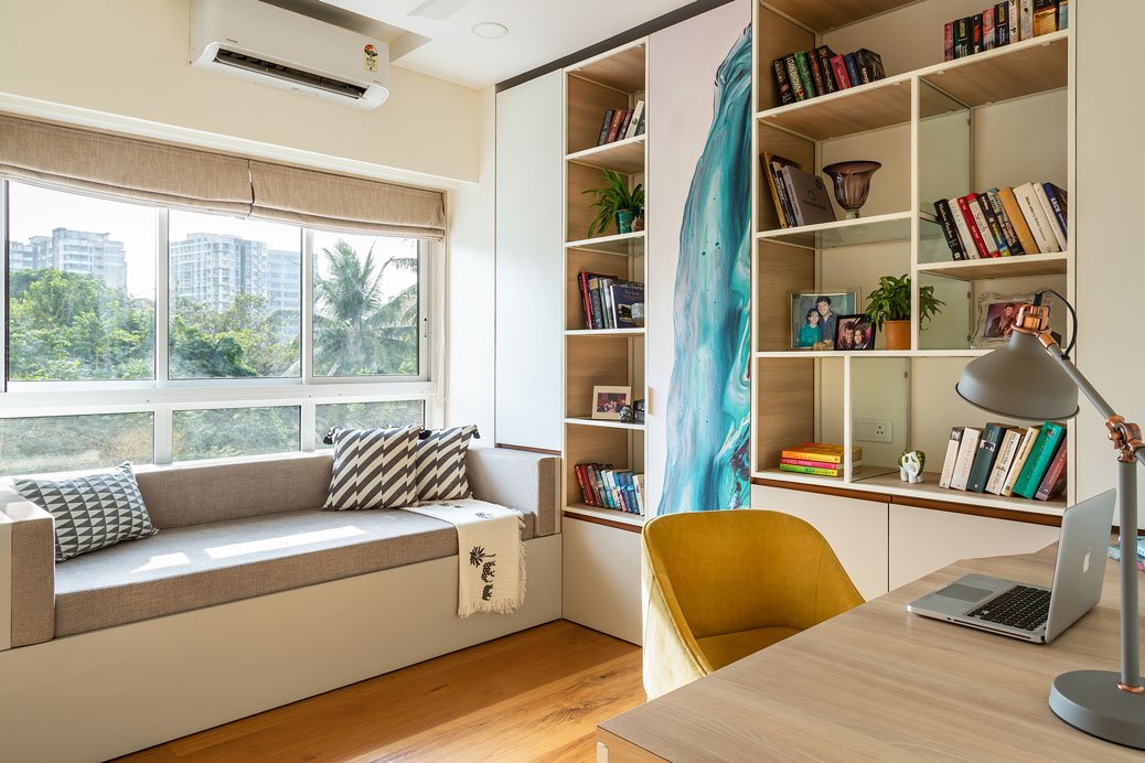
3.1 Neutral colour Schemes

Neutral colours such as white, beige, and grey possess a timeless and versatile allure, which explains their enduring popularity among homeowners. Aesthetic in nature, these blank canvases offer a versatile foundation for personalisation and effortless adaptation to evolving trends.
Neutrals can create a sense of expansiveness, lending rooms a spacious and ethereal ambience. With their timeless and adaptable nature, these neutral hues offer a versatile colour scheme for homes that serves as a flexible backdrop for your design preferences.
However, Without careful attention to texture and contrast, a neutral colour scheme may lack visual interest.
3.2 Monochromatic Colour Schemes

Monochromatic colour schemes involve using various shades and tones of a particular colour. Monochromatic schemes are elegant and harmonious, as they maintain a sense of visual consistency.
For instance, shades of blue can create a calming and cohesive atmosphere in a bedroom or bathroom. It allows you to dig into various gradations within your chosen hue, lending depth to the space without overpowering it.
Monochromatic choices in a colour scheme for home offer a visually appealing and elegant option that promotes a sense of balance and tranquillity. To craft a captivating narrative, one must skillfully weave together a wide array of tones, textures, and intricate patterns, igniting curiosity and engaging the audience.
3.3 Complementary colour Schemes

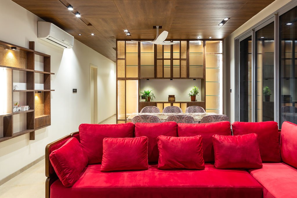
Complementary colour schemes involve selecting colours opposite each other on the colour wheel. The interplay among these vibrant hues creates an enchanting and visually striking impact. Adding these elements can infuse a sense of vitality and liveliness into a room, turning it into the centre of attention.
For example, pairing blue and orange can inject energy and vibrancy into a living room.
When aiming to make a strong and memorable statement in the shared spaces, mainly when entertaining guests, it is worth considering a complementary colour scheme for home for added impact. To maintain a visually harmonious composition, strike a delicate equilibrium and incorporate elements that are impartial and unbiased.
3.4 Analogous Colour Schemes

Analogous colour schemes involve choosing colours adjacent to each other on the colour wheel. The result is a beautiful sense of harmony and unity emerging from this. They possess an aesthetically pleasing quality that can evoke a cosy and welcoming ambiance.
These design ideas create a harmonic flow within large open-floor designs. For instance, using varying shades of yellow, yellow-orange, and orange in a kitchen can create a warm and inviting atmosphere.
An analogous colour scheme for home is a great choice to maintain a consistent and soothing ambience throughout a space.
3.5 Triadic Colour Schemes

Triadic colour schemes involve choosing three evenly spaced colours on the colour wheel. A wide range of colours, including both warm and cool tones, are skillfully blended, rendering them incredibly versatile. This particular approach fosters a harmonious and dynamic aesthetic.
For example, you can use red, yellow, and blue together to create a lively and energetic atmosphere in a playroom.
Incorporate a triadic colour scheme for home to infuse a sense of playfulness and creativity into a space. If not used thoughtfully, such colour schemes can appear chaotic. So, a thorough consideration of the proportions of each colour is necessary to maintain balance.
4. Colour Psychology and Mood
The exploration of colour psychology within interior design holds a captivating allure. It is a mesmerising aspect that unveils how different hues possess the ability to stir specific emotions within us and exert an influence over our mood.
Here's a brief overview of the psychological impact of some common colours:
4.1 Red
In the realm of colours, red is a vibrant and passionate hue that exudes energy, excitement, and love. It possesses the ability to improve one's appetite, making it a superb option for dining areas and kitchens.
Consider integrating red into your chosen colour scheme for home when establishing a vibrant and welcoming ambience. However, it should be used in moderation, as excessive red can be overwhelming.
4.2 Blue

The colour blue has a soothing and tranquil nature, promoting a sense of calmness and relaxation. It is a common practice to utilise this particular element in bedrooms and bathrooms for introducing an ambience characterised by serenity and calmness.
Illuminating shades of blue have the power to create an illusion of increased roominess, whereas deeper hues of blue introduce an element of depth and elegance to the space.
4.3 Green

Green, known for its association with nature and growth, is a colour choice that evokes a sense of refreshment and rejuvenation. It contains an extraordinary capacity to bring the marvels of the natural world indoors, cultivating a deep sense of harmony and unity.
Green is a popular choice for both living rooms and home offices as it has been known to enhance productivity and promote a sense of well-being. Embrace a green colour scheme for home when infusing your living spaces with vitality and balance.
4.4 Yellow

The colour yellow exudes a cheerful and refreshing vibe, evoking feelings of positivity and vitality. Applying this concept in kitchens, dining rooms, and playrooms can cultivate feelings of joy and optimism. However, balancing yellow with neutral tones is essential to avoid overwhelming a space.
4.5 Purple
Purple, a colour exuding regality and opulence, is often associated with the realms of imagination and spirituality. Its mere presence can effortlessly infuse an air of sophistication into both sleeping and dining spaces, rendering them elevated and refined.
Lighter shades of purple, such as lavender, create a soft and calming effect, while deeper purples convey a sense of opulence. Consider a purple colour scheme for home when you want to add a touch of luxury and sophistication to your living spaces.
4.6 Pink

The colour pink possesses a delightful and romantic essence, capable of instilling a sense of playfulness and charm. It is frequently utilised in bedrooms and nurseries, creating an ambience of tenderness and affection. The choice of pink shade can range from soft pastels to vibrant fuchsias, depending on the desired effect.
4.7 Brown

The colour brown, known for its warm and earthy tones, exudes a sense of stability and comfort. It is widely favoured for living rooms and home offices, as it has the ability to ground and provide a feeling of security. Brown can be effortlessly combined with a diverse range of colours, offering an array of effects and possibilities. Incorporate brown into your colour scheme for home to create a cosy and inviting atmosphere in your living spaces.
4.8 Black and White

The timeless colours of black and white exude an aura of sophistication and elegance, creating a sense of classic beauty that transcends trends and time. In contemporary and minimalist design, they are frequently employed to attain a visually streamlined and uncluttered aesthetic. Black and white can also be combined with pops of colour for added interest.
Each colour has its own set of associations and emotional triggers. By considering the psychological impact of colours, you can intentionally create environments that align with your desired mood and purpose for each room.
5. Practical Tips for Choosing a Colour Scheme
Now that we've explored the theory and psychology of colour, let's move on to some practical tips for choosing the perfect colour scheme for home:
5.1 Testing Paint Samples

Before committing to a specific colour, it's crucial to test paint samples in the actual space you plan to paint. Paint can look very different under various lighting conditions, so it's essential to see how the colour appears during different times of the day.
This valuable guidance will assist in avoiding any unexpected surprises and ensure complete satisfaction with the outcome.
5.2 Creating Mood Boards and Colour Swatches
To visualise the colour scheme, mood boards and colour swatches serve as valuable tools. In pursuing a desired colour palette, gathering precise visuals such as photographs, fabric samples, and paint chips is imperative.
Creating a physical or digital mood board can help you see how different elements come together. Use mood boards and colour swatches to clearly represent your chosen colour scheme for home.
5.3 Seeking Professional Advice

If one is uncertain about their colour choices or sees expert guidance, it would be advisable to seek the assistance of an interior designer or colour consultant. Experts possess valuable expertise, offering valuable perspectives, suggesting colour combinations, and assisting in attaining the desired ambience and appearance for one's abode.
5.4 Addressing Common Challenges in Colour Selection
When confronted with the task of selecting the perfect colour palette, one may encounter certain obstacles, such as harmonising with existing furniture or addressing limited natural light.
Common challenges in colour selection include dealing with limited natural light, open floor plans, and transitioning between rooms with different colour schemes.
To address these challenges, you may follow these aspects:
Limited Light: Opt for lighter colours to make the most of available light. Use mirrors strategically to reflect light and produce the illusion of more space.
Open Floor Plans: Maintain colour continuity by selecting a neutral or monochromatic scheme that flows seamlessly between areas.
Transitioning colours: Use architectural elements like mouldings or wall dividers to transition between spaces with different colour schemes for homes.
6. DIY vs. Professional Help

As you embark on your journey to choose the ideal colour palette for homes, you may ponder whether to take on the task yourself or enlist the aid of a professional.
6.1 Weighing the Advantages and Disadvantages of DIY Colour Selection
Here are the advantages and disadvantages listed below:
Advantages of DIY:
Cost savings: You won't incur fees for professional consultations.
Creative control: You have complete control over your colour choices.
Personal satisfaction: Successfully selecting colours can be a rewarding experience.
Disadvantages of DIY:
Lack of expertise: Choosing colours that work well together can be challenging for those without design experience.
Time-consuming: The process of selecting and testing colours can be time-intensive.
Risk of mistakes: Poor colour choices can lead to costly repainting and dissatisfaction.
6.2 The Benefits of Hiring an Interior Designer or Colour Consultant
Experienced interior designers can provide you with these critical services:
Expertise: Design professionals have extensive knowledge of colour theory and trends.
Tailored recommendations: They can create personalised colour schemes that align with your vision and needs.
Time-saving: Professionals streamline the selection process, saving time and potential mistakes.
Access to resources: Designers can access a wide range of paint colours, finishes, and decor options.
Whether you choose to go it alone or seek expert advice, the key is to make informed decisions about the colour scheme for home.
7. Implementing Your Chosen Colour Scheme
Once the ideal colour palette has been chosen for one's home, it is time to implement the plan and bring it to life. Here are some practical steps to help you implement your chosen colour scheme for home:
7.1 Painting and Decorating with Your Chosen Colours
Start by painting the walls in your chosen colours. Be sure to follow proper painting techniques for the best results. Here are some tips:
Prepare the space: Remove furniture and cover floors and furnishings to protect them during the painting process.
Start with a primer: Applying a primer ensures better adhesion and a more even finish.
Paint in natural light: Whenever possible, paint during daylight hours to accurately assess colours.
Layer with neutrals: Use neutral colours for large surfaces like walls and floors, reserving bold colours for accents and decor.
Consider texture: Incorporate texture through textiles, upholstery, and decor items to add depth to your colour scheme.
7.2 Accessorising and Furniture Selection to Complement the Scheme

Achieving a harmonious appearance requires a careful selection of furniture and accessories that complement the chosen colour scheme for home. Consider the following tips:
Balance boldness: If your colour scheme for home includes vibrant or bold colours, balance them with neutral or complementary shades in furniture and decor.
Pattern and texture: Incorporate patterns and textures in fabrics, rugs, and pillows to add visual interest to the room.
Accent colours: Use accent colours sparingly for a pop of colour in decor items such as throw pillows, artwork, or vases.
Furniture finishes: Choose furniture finishes that harmonise with your colour scheme, whether light wood tones, dark stains, or painted finishes.
7.3 Maintenance and Upkeep
Remember that maintaining your chosen colour scheme for home requires regular care. To maintain the appeal and freshness of your home, it is imperative to preserve the colour pattern of your space. Regular cleaning, touch-ups, and occasional refreshments can keep your home looking vibrant and well-maintained.
From Colour Theory to Your Home's Vibrant Reality: Hipcouch - Your Path to Perfect Palettes
Selecting the ideal colour palette for one's home entails a multifaceted process, involving the careful consideration of colour theory, individual preferences, room functionality, and the psychological impact of colours.
When one considers the colour scheme for home, whether it is monochromatic, complementary, or analogous, it becomes crucial to choose options that deeply resonate with their personal vision for their living spaces.
Hipcouch offers a highly skilled team of interior designers and colour consultants with a wealth of experience. We are readily available to offer tailored guidance and recommendations, enabling you to bring your unique vision to life.
So, whether you're seeking to revitalise a single room or embark on a complete home transformation, Hipcouch can be your reliable companion in enhancing the aesthetics and functionality of your living space.